Back in summer 2017, we realised that our design process had some serious flaws. It took time, courage, and a lot of self-reflection to realise that we were the problem and not the client.
Here are a few things we learned the hard way, which might help you if you're planning to build your own product too.
The idea is only the 10%
Or 5% or 20%, I don’t know. But it’s definitely a tiny piece of the whole pie. When we came up with the idea for what would become the creative brief online tool HolaBrief, we thought the hardest part was done. We were of course, totally wrong.
There are obviously lots of important things to keep in mind when you're starting out, from legal checks to promotion, and we'll talk about these soon. But the most important thing to remember is not to fall in love with your idea. Ever.
The same happen to us designers, when we present 2 or 3 proposals to a client. Usually you present the idea your client wants to see along with the one you love, maybe sometimes something in the middle. Then you subtly try to convince your client that your idea is the best one. It’s a mistake, because you should go for the idea that works best according to the creative briefing, and falling in love with your idea of your product is a mistake in the same way.
Products evolve, and the more you work on a project and get to know your audience the more you realise that you need to pivot and adjust your strategy, your features, your priorities, your...well, everything.
So okay, fall in love with the concept of your product. But never fall in love with the small details. I know that little animation means a lot to you, but believe me, at this point it’s totally insignificant.
Sketches rather than wireframes
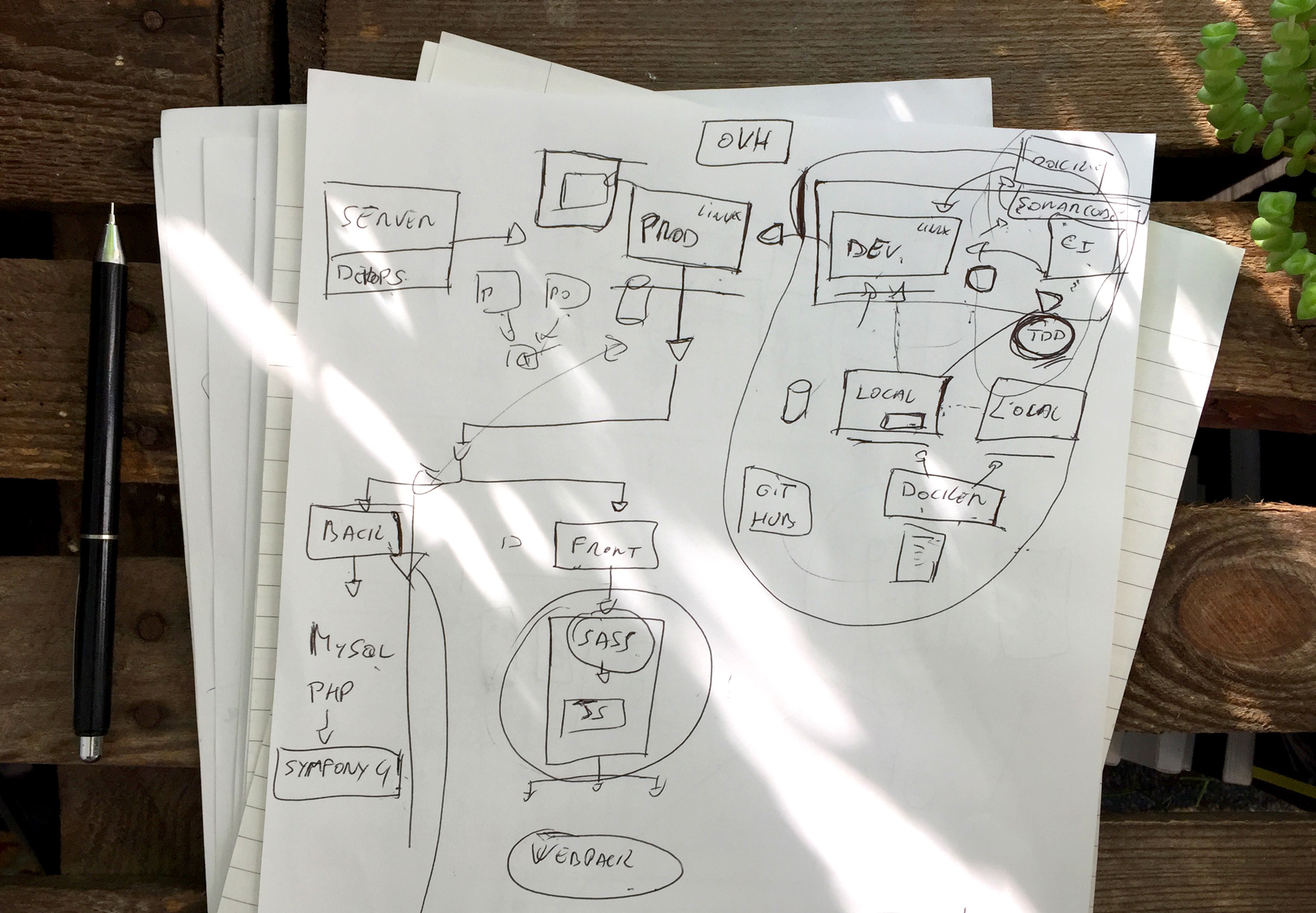
It took us around 3 months to come up with some initial wireframes, which were then thrown away when the developers joined the project.
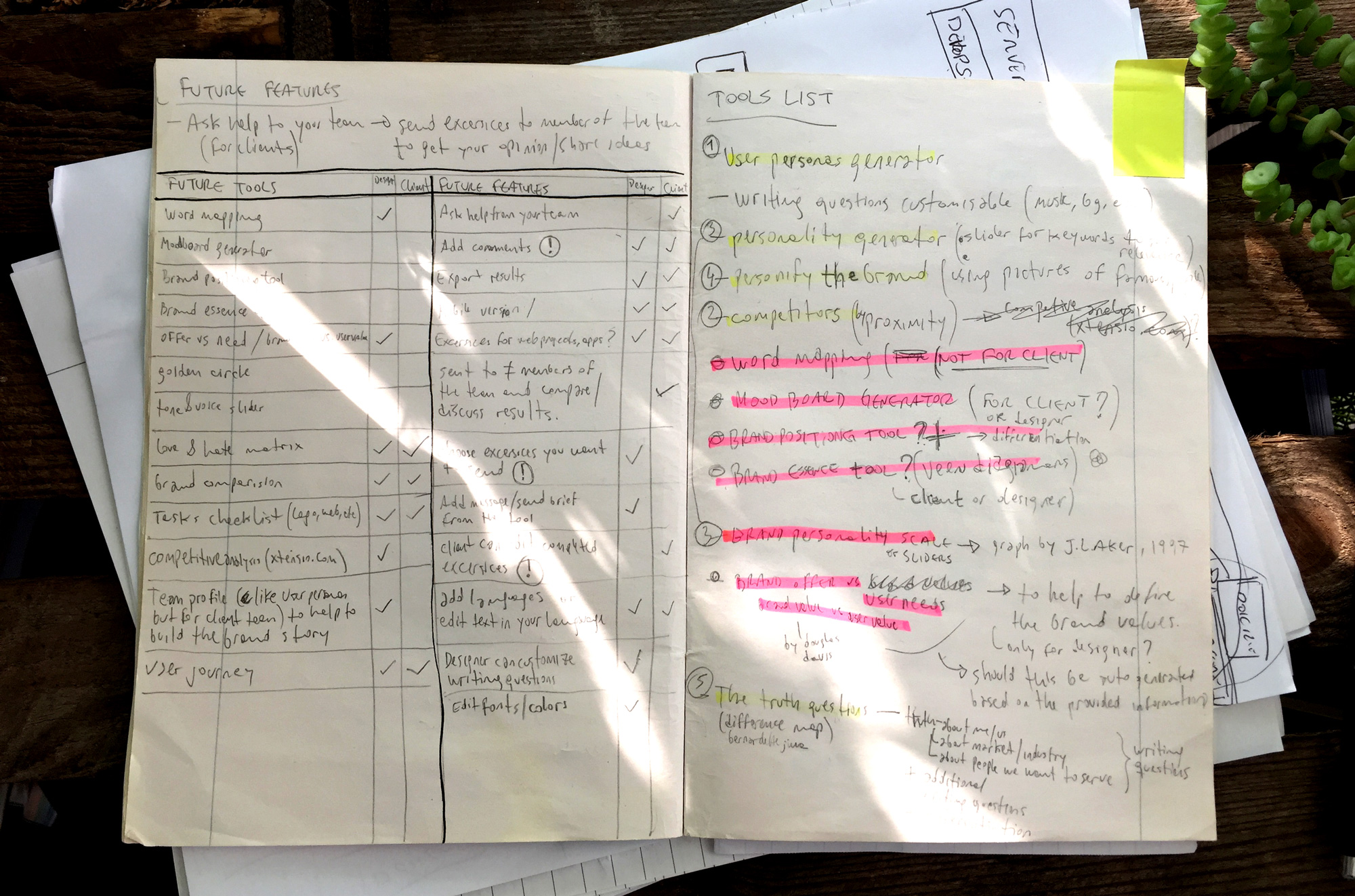
We focused on making the wireframes nice and clean (after all, we are designers) when at this point all you need is a pen a -a lot- of paper to quickly iterate and discard stupid ideas until, eventually, you end up with something that starts to make sense.
Wireframes are super useful, especially at this initial stage. They help to define the scope of the project, to discuss ideas on paper, and to put everyone on the same page, reducing the “oh, I thought you meant...” effect. Also, through the wireframes you can start to see some usability issues and patterns to consider.
So do wireframes, do all the wireframes you can, but don’t put too much effort into the visual side of something that is meant to be not nice or perfect but fast and effective. If you’re a designer building a product, forget about aesthetics at this point. It hurts but it’s worth it.

Learning weird stuff from our developers.
Legalize it
Here’s another classic designer mistake. The minute you have that brilliant product idea, followed by a brilliant name for it, you start focusing on easily the least important thing: designing the logo.
We did it, of course. And there are at least 3 good reasons why I strongly recommend that you don’t:
- At this point, your product doesn’t have an identity yet so the logo is really just a placeholder. Another reality check for our designer egos.
- You should spend your time and energy in defining the soul of the product. Focus on the essence.
- If you didn’t run a legal check first, you’ll probably have to look for another name, meaning designing another logo. Legalize it.
That last point is what I want to stress in this section. We didn’t run a legal check first, and guess what happened? We had a super cool name and a clever logo that both fit our project perfectly and looked great in our shiny wireframes. The .com was even available. That logo lived with us for a good five or six months, until we finally run a proper legal check - with lawyers and everything - and found out that we couldn’t use it. So we had to kill it.
On the bright side, after a ridiculous amount of time spent brainstorming names we came up with one that we and almost everyone we know loves even more than the previous one.
You don't know your audience like you think you do
The equation is simple:
You are a designer using different online tools in your workflow
+ you are building an online tool for designers
= you yourself are the audience.
The thing is, you’re just a small part of that audience. There are other designers working with other processes who have different needs, preferences, and priorities than you do.
Building a solution for your own problems is definitely an advantage, but don’t assume that everyone else thinks like you. Our research helped us to understand our colleagues better. Here are some interesting facts we discovered:
— 91% get clients through referrals.
This reflects the importance of creating long-term partnerships and good relationships with clients.
— 66% customise their briefing for every client.
So they need some sort of creative brief template, but it has to be flexible.
— 11% discuss the briefing over the phone.
Having everything written down gives both designer and client the confidence that everyone is on the same page.
This wasn’t very deep research, but it still gave us some interesting insights that we didn’t have before., These became extremely important in shaping our online creative brief tool and creating something that is useful for not only us but also lots of other people, including designers, agencies and interestingly clients (this is one of the most interesting things we learned).
Is not how you look, it’s how you talk
We designers tend to focus on the visual aspects of a brand, believing that it’s the only thing that will make a project successful. We spend hours finding the right typeface, creating endless mood boards full of visual references or applying the golden ratio… All that is great, but it isn’t important at this stage. Not at all.
Your voice is what really matters. You need to understand who you are as a company, but more importantly as a human being. You need to define your core values and stick to them.
Then it’s just a matter of translating these values into words and day-to-day actions that will help you engage with your audience in a more natural way. Being yourself will help you define your brand voice and then it will be easier to create a visual language that reflects your inner truth.
Taking multi-tasking to the next level
I have blurred memories of the days when I used to spend my whole day designing, watching tutorials to learn new skills, or organising my design bookmarks…those were good times.
Don’t be naive and think that you’ll start building your own product while keeping your regular designer routine. Your life, for better or for worse, will radically change.
You will learn to roll with the punches. Project management, copywriting, social media management, business strategy, marketing strategy, bookkeeping… you will have to do all this and more until you’re able to bring people to your team to help you out. For us, it was all quite stressful and pretty unrelated to our design backgrounds, but at least we developed skills that we couldn’t have imagined we'd be able to learn, and quickly.
Also, one of the most painful things for us (especially for me) was the fact that we had to get out our comfort zone and start networking more. It hurts, but it’s necessary.
This level of multi-tasking is hard, especially if you’re like us - we decided to launch two brands at the same time while continuing to work with some of our existing clients! Keeping focused and mentally strong to overcome the ups and downs that will come is a huge challenge. But hey, who said it would be easy?
Launch soon(er)
Succumbing to perfectionism is another mistake we made. We spent so much time polishing details of user interface and animations that we lost focus on our main objective: finding out if all of it was even worth it.
We read about the build, learn, measure loop, we learnt that we need to ship to learn and get rid of features and launch sooner instead of waiting ages until your to-do list is completed.

Trying to get rid of features. But they are all so important!
So why didn’t we launch sooner? I think we got stage fright. We were scared of getting our work out there. We were afraid of what people would say. All the criticism, all the “one year for this, really?”.
The truth is that nothing of that happens. There might be people that don’t like what we’re doing, sure. But we mostly hear good things about our product and even the criticism turned out to be more constructive than destructive. We confirmed it right after we launched.
Future
One year after we took the leap and went after that brilliant idea, we’re still here, and just that is something. We don’t know what will happen in the next few months and we try to not to think about it; long-term planning rarely works.
For now we’re concentrating on two things:
- Getting ready for the public launch: this means refining our online creative brief tool, finding out a fair pricing strategy that works for everyone, spreading the word and triple testing everything. And all the other things I’m forgetting.
- Giving teams the attention they deserve: Now that the foundations are set, we’re going to focus on developing the right features for teams, both from agencies and studios and clients. We know they’re using the tool and it’s time we take care of them.
It won't be easy and we won’t know how to do everything, but as the little piece of paper hanging on our wall says: an object in motion stays in motion.


