To start, a quick definition from Wikipedia:
Modularity: the degree to which a system's components may be separated and recombined, often with the benefit of flexibility and variety in use. — Wikipedia
When an identity designer creates something, it is comprised of pixels, ink drops, pencil markings, brush strokes. In this sense, the designer is adhering to a set of rules (or modules), however small they are. Now enlarge the smallest unit (the humble pixel) to a larger unit: a motif, a narrative, a grid, etc. From here, start to think of your modular unit as the cornerstone of a brand identity system.
At the heart of dynamic branding systems lie an intense struggle: consistency vs inconsistency. Consistency, being the idea that any touchpoint evokes the accurate perception of the brand; inconsistency (more accurately: uniqueness, fluidity or adaptability), being the differentiator that brings character and intrigue. Building upon the modular unit with the successful marriage of these two contrasting concepts is the beginning of a brand identity that makes sense...
Modern identity systems are implementing fluidity. New and various formats and screen sizes necessitate adaptable dynamic brands. But apart from it’s visual responsiveness, breaking apart brand elements and reimagining them in different conceptual ways is intriguing to the consumer. It adds dynamic to the message without introducing confusion. In the end, it should solidify the essence of the brand identity you create. Let’s look at three approaches who successfully integrated dynamic branding.
The MIT Media Lab Modular Branding Identity
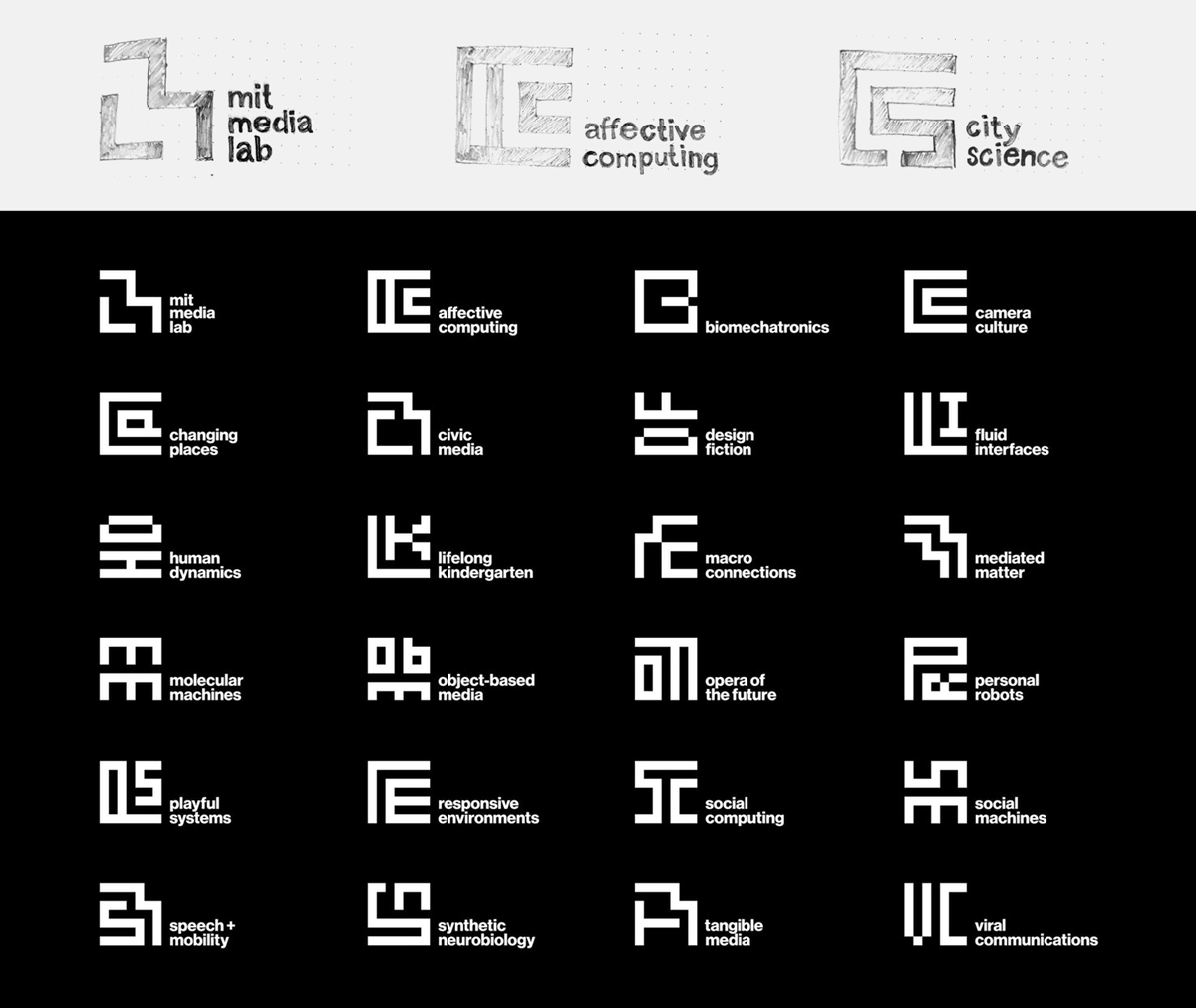
An expert example of modularity is the design system for MIT Media Lab. Pentagram used a grid structure to expand the MIT brand identity to 23 research groups in the Lab. I’ve redrawn three of the logos on grid paper to show the 7 x 7 structure.

“The result is an interrelated system of glyphs that at once establishes a fixed identity for the Media Lab, but celebrates the diversity of activity that makes the Lab great.” — Pentagram
You can see the 23 research groups based on the initial “ML” glyph. Much like a language, these work excellent as a system. Being both complex and simple, the system proves to be extremely consistent while also quite fluid.
The Fin & Fino Approach
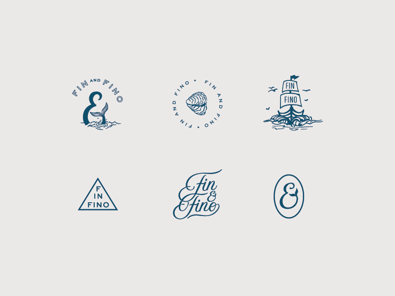
Another great example in modularity is the branding system for North Carolina seafood eatery, Fin & Fino. It’s built of multiple unique yet seamless elements. I’d call this a narrative structure, where various type treatments and styles are used to unify the system while adding charm and character.


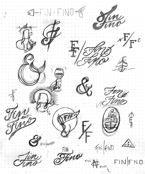
I caught up with the designer, Anna Kate Bryan, who shared valuable insight into the process. These process sketches are helpful in understanding how to think in modular terms. Anna Kate explained that fluidity is achieved by the sheer quantity of marks, making the brand scalable and flexible. This gives more depth than one main logo distilled into multiple lockups that would become stagnant over time.
“The entirety of the brand is comprised of multiple different elements which are unique on their own, but work together visually to tell the story”. — Anna Kate Bryan, The Plaid Penguin
The 23andMe Dynamic Logo System
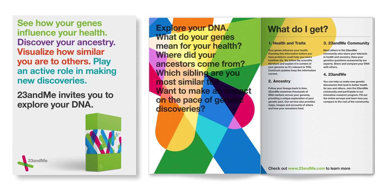
A motif structure is the backbone to Metadesign’s 23andMe identity. As a personal genetic research company, 23andMe is already ingrained in the concepts of personal and uniqueness. Metadesign built 23 distinctly unified logos that reference the building blocks of DNA.


“The identity successfully reduces the intimidation associated with the field of personal genetics, thus distinguishing the brand in an emerging and exciting field." — Anne Wojcicki, Co-founder
Citing “friendliness” and “approachability”, 23andMe boasts this motif that can be used as an underlying design element for collateral.
Closing thoughts
These are just a few interesting examples out in the world of dynamic branding. But be aware, this approach shouldn't be used carelessly. Next time a new client approaches you with a new identity project, ask yourself these 4 questions:
- Does it fit your client's brand?
- Will using a dynamic identity system speak to the end users of your client's business as described in the brand brief?
- Can I make sure all of the singular variants are as strong as a singular logo?
- Does the client's business/system have the flexibility to play with the look of the branding?
If the answer is YES to all of these questions, then make it happen!
If the answer is NO, don't forget that a well-designed, strong logo mark can make the jump from print to web to animation by itself in all its grandeur too.
Whatever you choose, make sure the end result is aligned with the strategic analysis summarized in the creative brief, in order to have a successful outcome without any frustrations.
Avoid any misunderstandings, get on the same page and set up your first brand brief together with your client, on HolaBrief.


